The third tab within the Market Explorer tool is the Benchmarking report, a competitive benchmarking tool that allows you to compare the performance of up to 5 competitors against the overall market trend. It is available exclusively to Semrush users who have added the .Trends solution to their subscriptions.
How Can the Benchmarking Report Help Me?
The Benchmarking report was designed to show you how competitors are performing within your space. By comparing these trends to those of the market as a whole, you can gain strategic insights into:
- Your competitors’ traffic generation strategies
- The social media distribution channels they use most
- The demographic breakdown of each competitor’s audience
- The market share each of them occupy
- How the traffic gains of each competitor have been changing over time
Using the Benchmarking Report
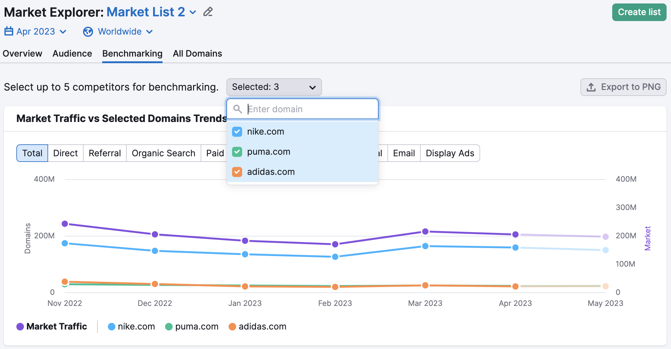
To get the most out of this report, first, select the competitors you would like to benchmark against. You may select up to 5 domains to benchmark from your selected industry or custom market list.
Each widget within the Benchmarking report will be color coded so that you can easily differentiate and compare.
If you’d like to export the first three widgets of the Benchmarking report, you may do so by clicking “Export to PNG” in the top right corner of the report.
Market Traffic vs Selected Domains Trends
The first widget you’ll see on the Benchmarking report is Market Traffic vs. Selected Domains Trends. This widget is a line graph that shows you traffic trends over time for your selected domains across five different acquisition channels (Total Traffic, Direct Traffic, Referral Traffic, Organic Search Traffic, Paid Search Traffic, Organic Social Traffic, Paid Social Traffic, Email Traffic, and Display Ads Traffic ), compared to the overall traffic for the entire market during that same period.
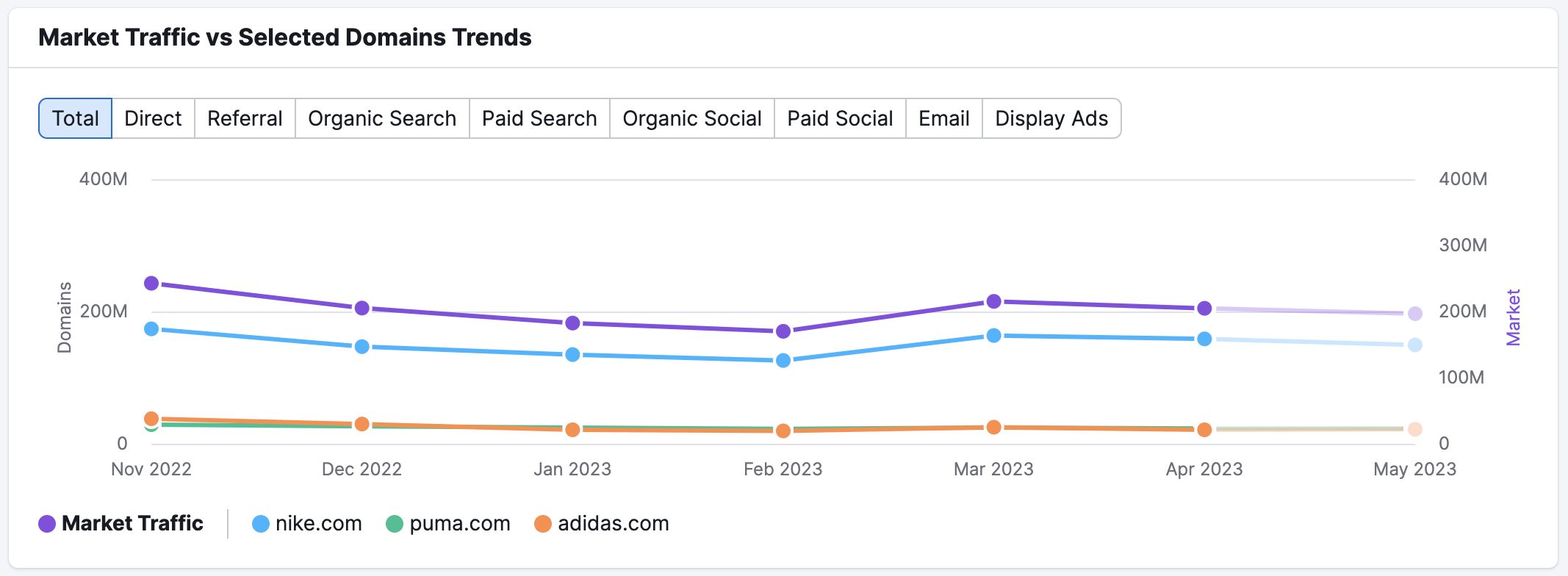
On this graph, the left axis indicates the traffic volume for each individual domain, while the right axis indicates the traffic volume for the total market. The horizontal axis shows the months and years being viewed across the selected time frame. Beneath the chart, you’ll find the key, showing which color represents each domain.
To view the specific amount of traffic at a particular time on the graph, place your cursor over the period you’re interested in, and a window will appear.
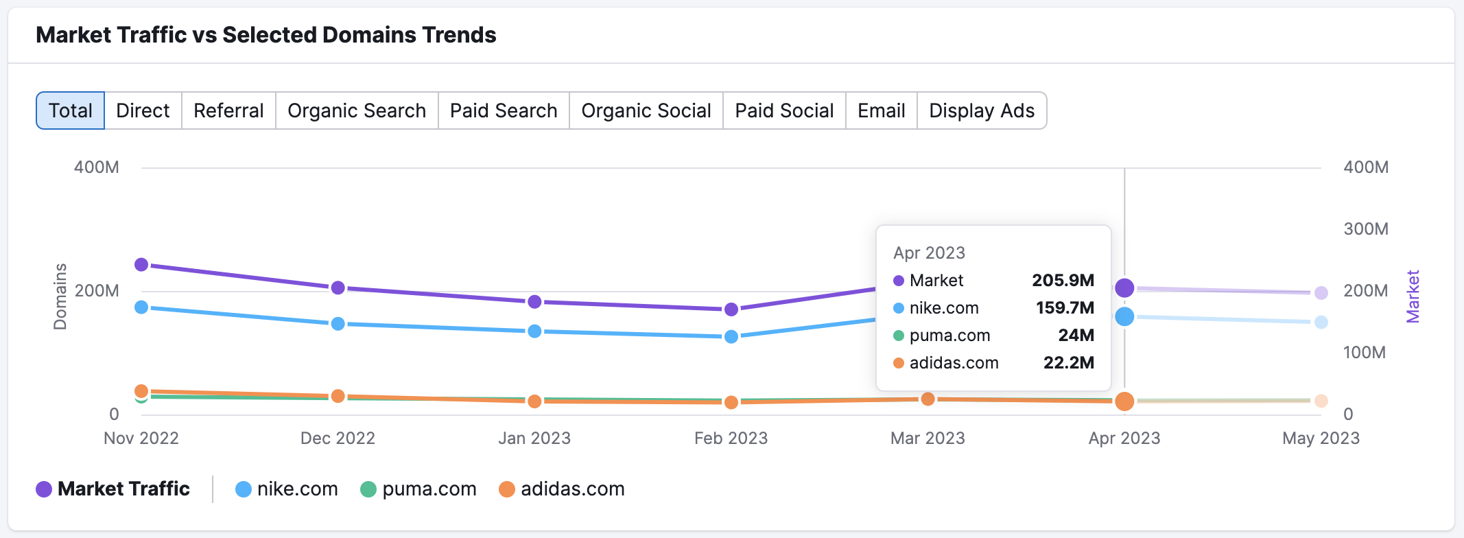
This widget also offers forecasted data for the current month. The traffic forecast appears as the grayed-out portion of the graph. You can hover over this portion of the graph for more details. Traffic forecasts are based on the current month’s metrics so far and are updated once a week. These predictions can help you stay ahead of emerging traffic trends and prepare your strategy before your competitors do.
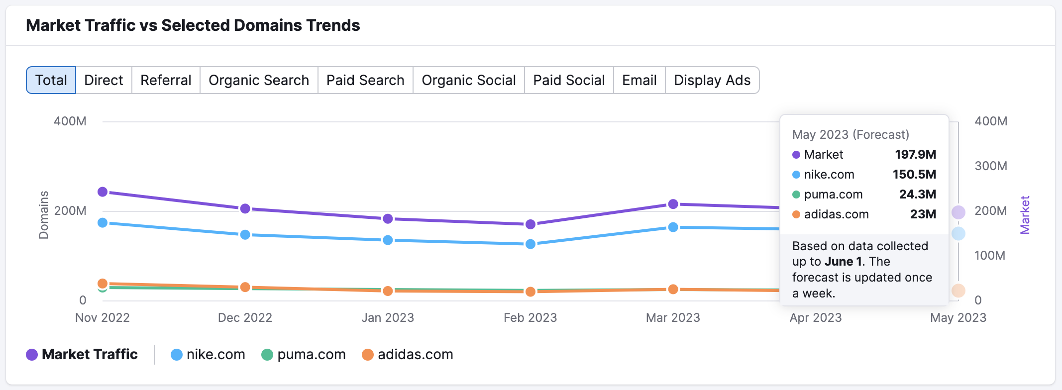
By default, this graph displays total traffic across all channels over a period of six months. However, you can customize this view by selecting a desired time range above the widget. Note that you cannot select more than 12 months at once.
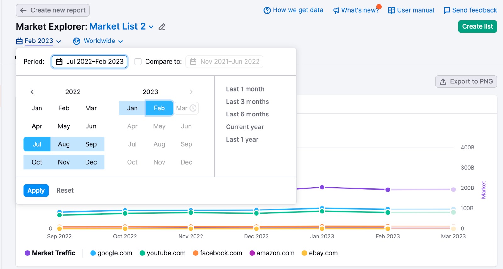
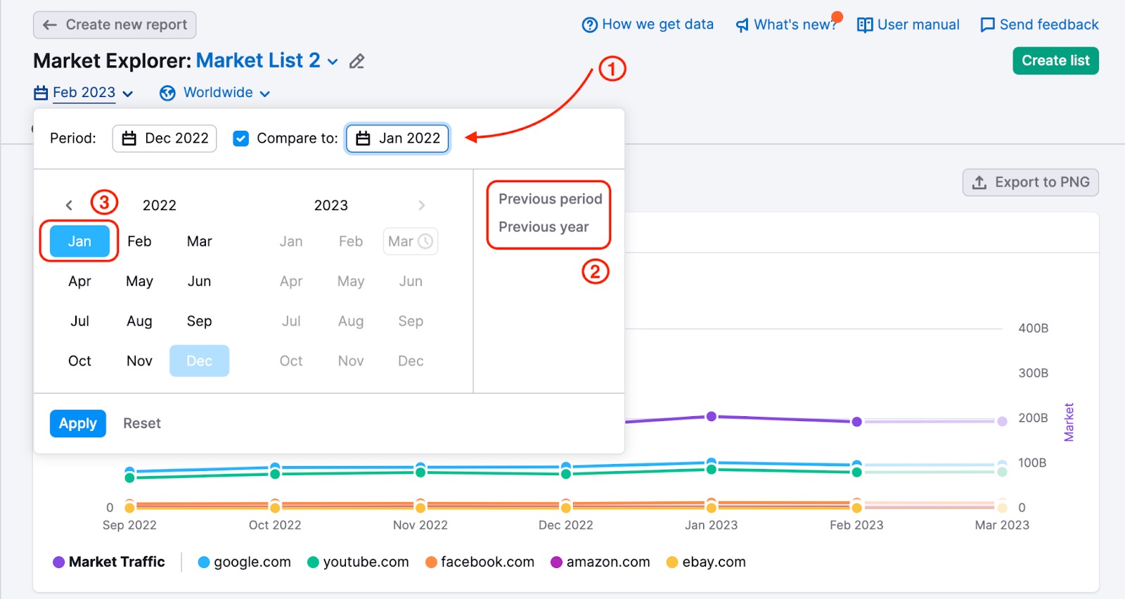
You can also choose how you want to monitor metric changes using the Custom periods option. In order to see data for a custom period (for two individual months or two periods of up to 12 months), you need to set the date range, check the “compare to” checkbox (1), and select the second date range – you can choose to compare to the “previous period” or “previous year” (2) or set the period manually (3).
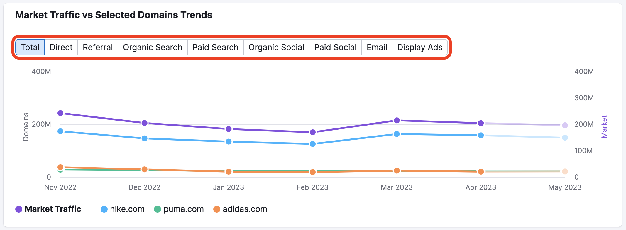
To specify a traffic channel to view, simply click on the name of the channel you’re interested in. Channels include Total Traffic, Direct Traffic, Referral Traffic, Organic Search Traffic, Paid Search Traffic, Organic Social Traffic, Paid Social Traffic, Email Traffic, and Display Ads Traffic.
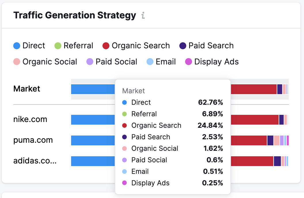
Traffic Generation Strategy
Below Market Traffic vs. Selected Domains, you’ll find the Traffic Generation Strategy widget. This bar graph breaks down the share of traffic attributable to each acquisition channel for all analyzed competitors during the analyzed month, compared to the total market.
This can help you understand the top sources of traffic for your competitors or benchmark your own traffic against your competition and the total market.
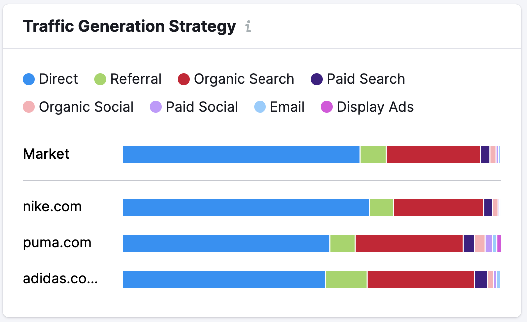
If you want to view a numerical breakdown of each channel’s share of traffic for a specific competitor (or total market), place your cursor over the one you want to view, and a window will appear.
Social Media Distribution Strategy
To the right of the Traffic Generation Strategy widget, you’ll find the Social Media Distribution Strategy widget. Similar in nature and appearance to Traffic Generation Strategy, this bar graph breaks down the top social media channels used by each competitor during the selected month, compared to the total market.
This can help you to understand your competitor’s social media strategy, or benchmark your own strategy against theirs and the market.
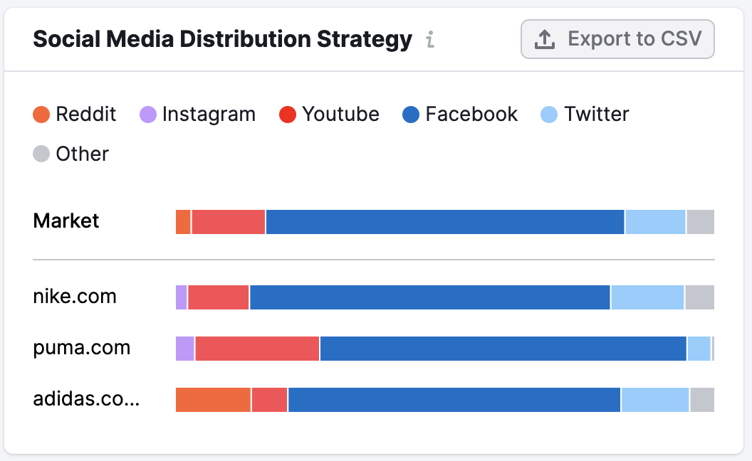
If you need to view a numerical breakdown of a specific domain or the market’s social media distribution, place your cursor over the one you want to view and a window will appear.
If you want to export this data, click “Export to CSV” in the top right corner of the widget.
Market vs. Selected Domains: Audience
Next, you’ll find the Market vs. Selected Domains: Audience widget. This contains two bar graphs, comparing the audience demographics of each competitor to the total market, by reported age and sex.
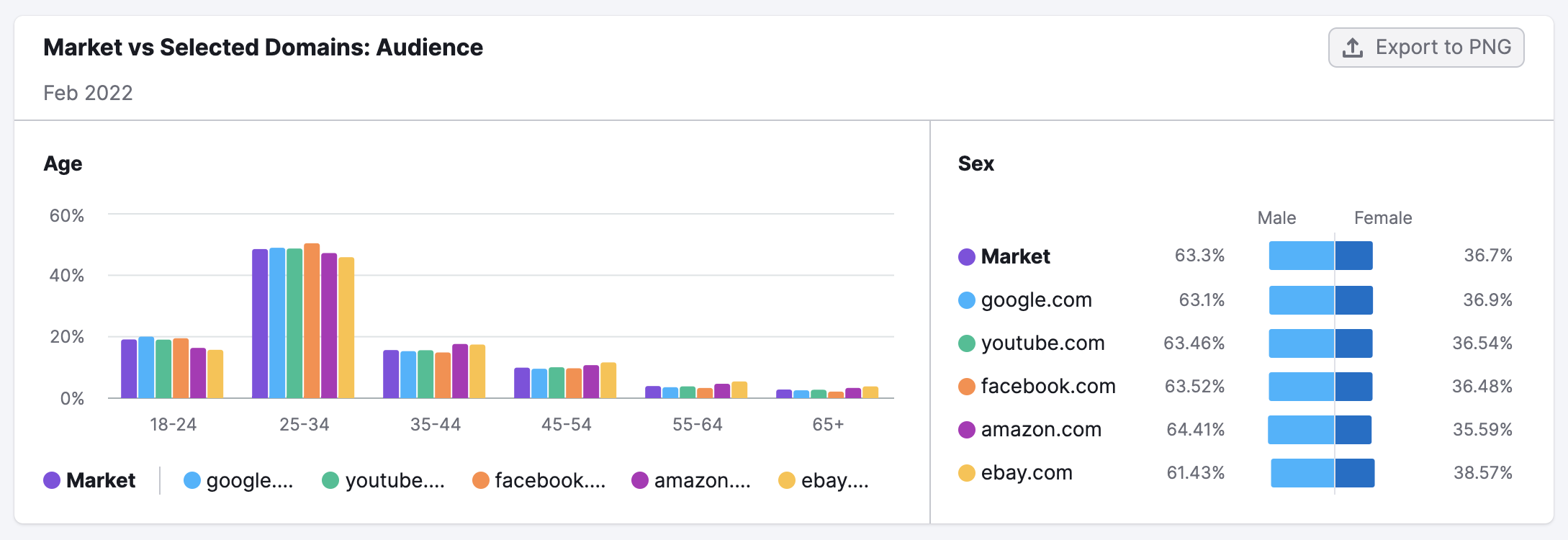
On the left, you’ll find a bar graph breaking down demographics by age. The vertical axis on the left shows the share of the audience, and the horizontal axis shows the age brackets. The total market and each analyzed competitor are color coded. You can find the key beneath the horizontal axis.
To the right is a second bar graph, showing you the sex breakdown of each competitor’s audience, compared to that of the total market.
If you want to see a numerical breakdown of any item analyzed here, place your cursor over the one you want more information about and a window will appear.
If you need to export this information, simply click “Export to PNG” in the top right corner of the widget.
Market Share by Channel
The final item in the Benchmarking report is Market Share by Channel. This chart breaks down each domain’s market share across distribution channels. Unlike previous widgets, this one does not include a comparison to the total market.
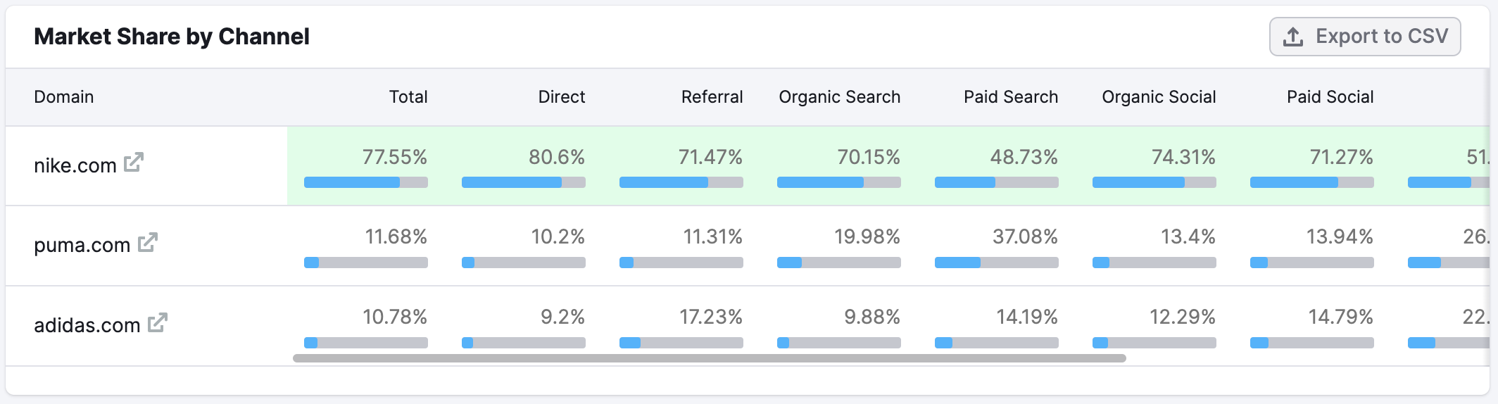
The competitor who is the strongest in a particular channel is highlighted in green.
If you need to export this data, click on the “Export to CSV” button in the top right corner of the widget.