The Market Explorer Overview report provides a bird’s eye view of the market activity within a certain space.
You can use the Overview report to learn:
- The size of your market and the level of market competition
- Who is your biggest organic competition within your industry
- Overall traffic trends in your space and who has the largest share of traffic
- How your growth and traffic generation compares to the market as a whole
- Where your audience is around the world, and how they find you or your competitors
Decide How to Gather Your Data
When you first enter the Market Explorer tool, you’ll need to select how you want the tool to gather and organize your data. The tool offers 3 options:
- Create List: enter a list of up to 100 domains to create a custom market. Though the tool makes domain recommendations, you’ll need to make the decisions about what domains to choose.
- Find Competitors: enter a starting domain and allow the tool to select additional competitors surrounding that domain. Competitor suggestions are based on organic search results.
- Analyze Category: Choose one of 110 business categories, and the tool compiles data for the top 1,000 domains within that industry.
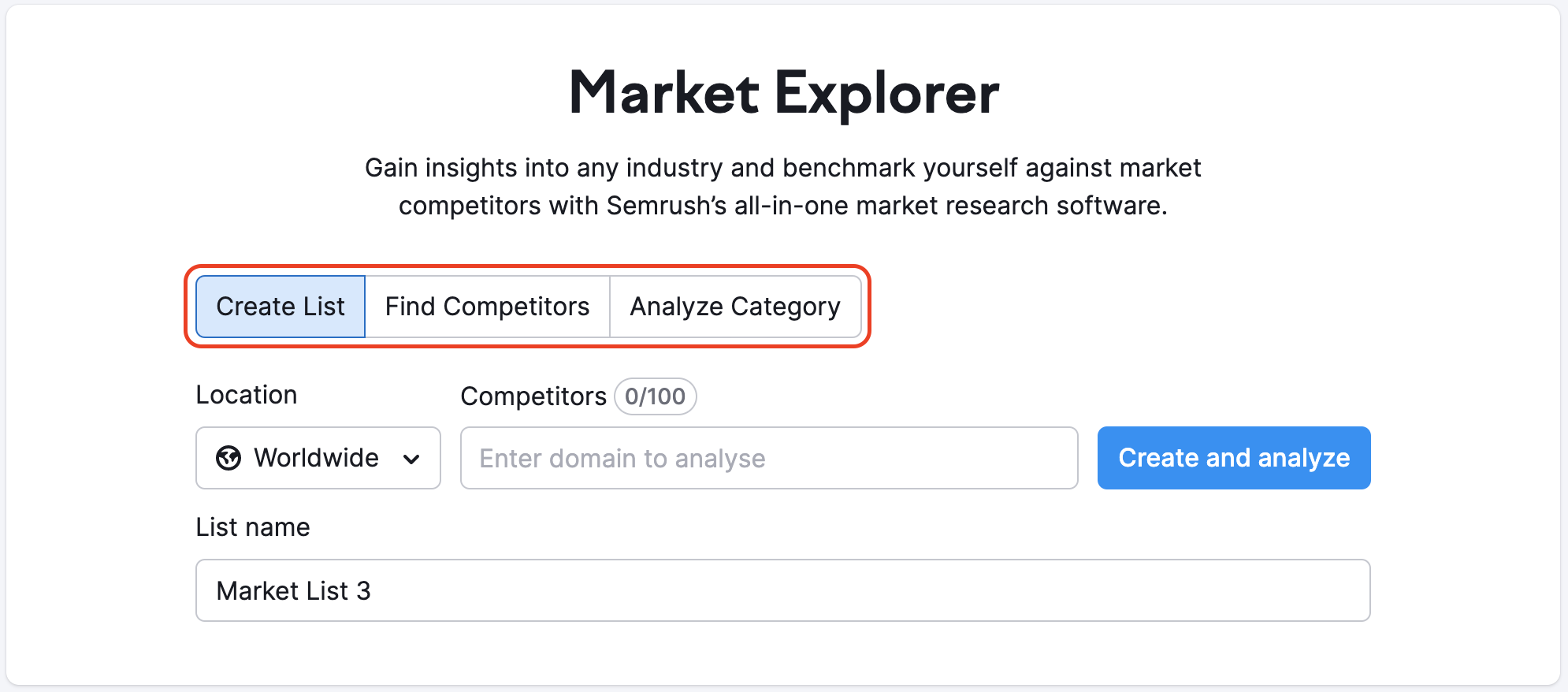
With each option, you’ll also need to select a geographic location (country, region, or worldwide). The Create List option also allows you to name the list and save it for further analysis later.
Once you’ve made your selection, the tool will bring you to the Overview Report, where you can begin your market analysis.
Side note: you can also use Semrush Open .Trends for analyzing website rankings and traffic data across an entire industry. This is a great option if you don’t yet have a .Trends subscription, or just want a quick overview of an industry’s top websites.
Using the Overview Report
There’re a few different options when viewing the Market Overview report. First, you can toggle between your chosen domain, saved lists, and various market categories.
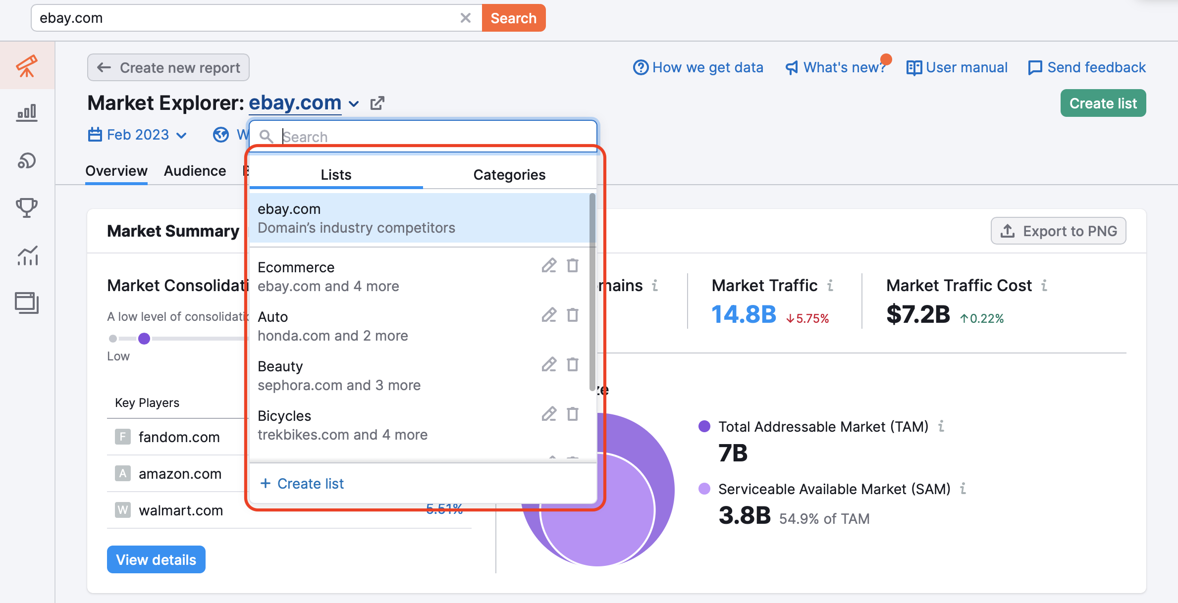
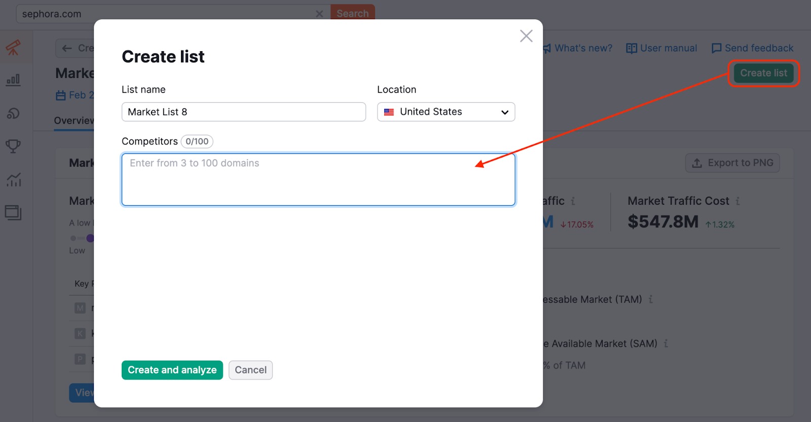
You can also create a new list at any time using the Create list button in the upper right-hand corner of the screen. After clicking the button, the Create list screen will appear. Simply choose a name for your list, select a location, and enter up to 100 domains you’d like to analyze into the Competitors box. You can then view this list in Market Explorer and import it to other tools across the .Trends tools.
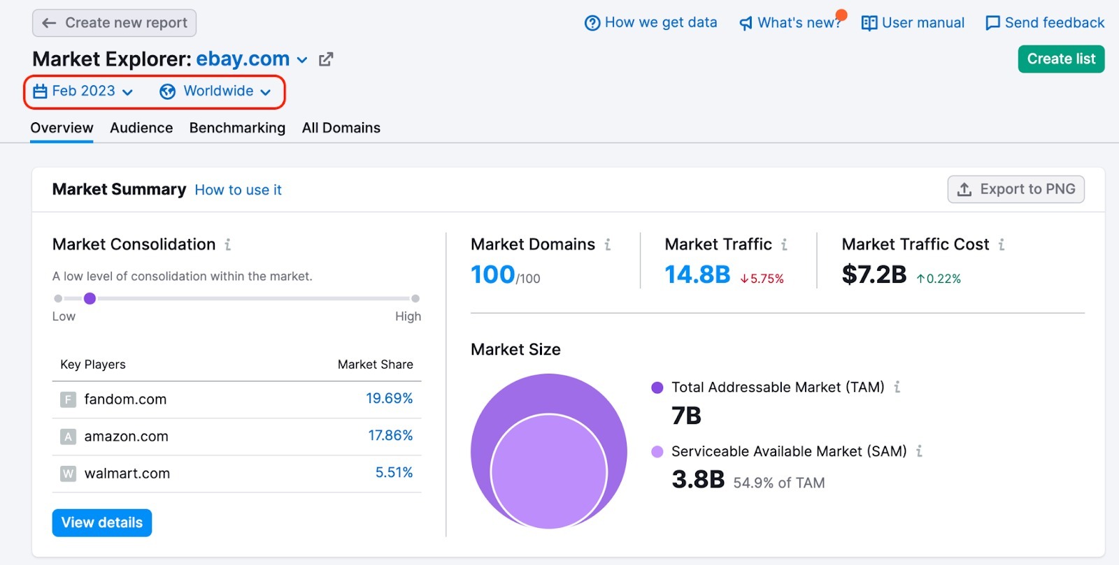
Finally, you can also change which country’s database you’re looking at (the view is set to worldwide by default), or view historical data by selecting a different time period, or use the Custom periods option to filter data in various ways.
In order to see data for a custom period ( for two individual months or two periods of up to 12 months), you need to set the date range, check the “compare to” checkbox (1), and select the second date range – you can choose to compare to the “previous period” or “previous year” (2) or set the period manually (3).
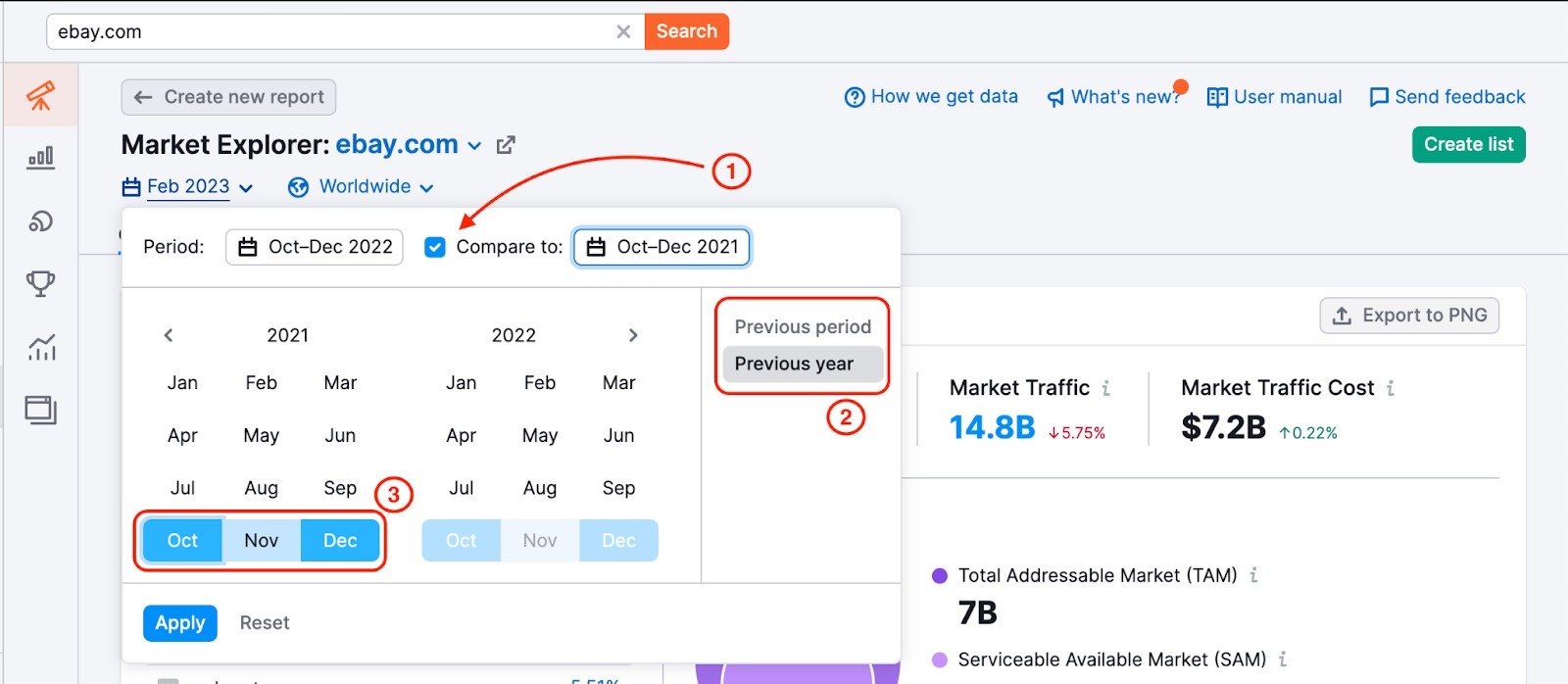
In the widgets, you will see data for the periods you’re comparing.
The ability to compare custom periods makes it easy to analyze seasonal dynamics and identify difficult-to-spot market trends early.
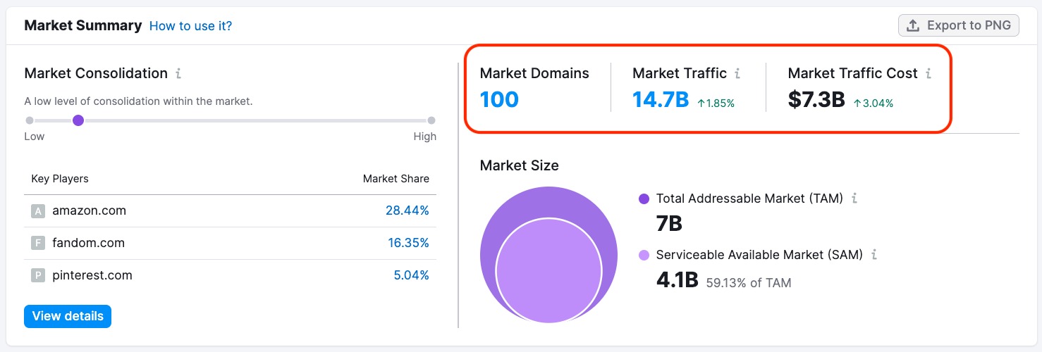
Market Summary
The Market Summary is the first section of the Overview Report. It provides a variety of metrics that help you quickly assess the state of your market. This information is intended to give you a wide market view, including the market’s size, value, and competition levels.
In the upper right-hand corner, you’ll discover general market information, including:
- Market Domains: The number of domains within your selected market.
- Market Traffic: The total traffic of all market domains found over a selected month.
- Market Traffic Cost: The sum of the estimated costs of all market domains to rank for organic keywords over a selected month.
Market Consolidation
On the left side, you’ll find data about Market Consolidation. This part of the tool can help you understand how the total market share is distributed among market players.
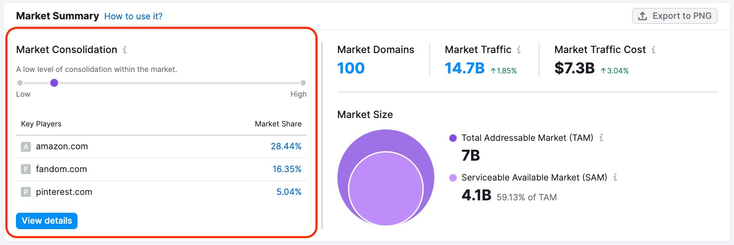
The scale goes from “Low” levels of consolidation on the left to “High” levels of consolidation on the right.
- Low consolidation means the total market share is distributed among a large number of market players.
- High consolidation means one or two market players own the majority of the market share.
The higher the consolidation levels, the harder it can be for smaller players to enter and compete in the market.
Below the Market Consolidation score, the widget lists Key Players in your market. The Market Share metric to the right of the player’s name reflects the percentage of the site’s traffic compared to the total traffic of all the domains over a selected month.
Clicking the blue “View details” button brings you down to the Domain vs Market Dynamics section of the overview report for more in-depth information about market share and traffic trends.
Market Size
Finally, the section includes a graph depicting the Market Size. This graph can help you better understand your target market.
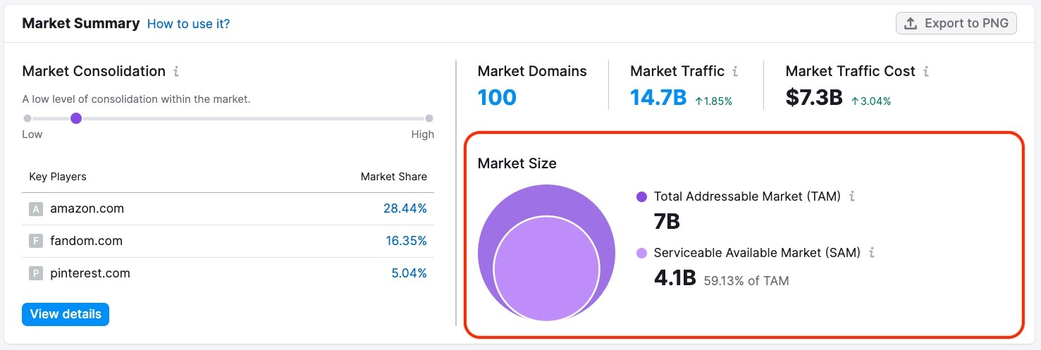
Market Size is the total number of potential buyers in your market. It’s important to consider when launching new products, developing business or marketing strategies, or projecting potential ROI for a particular market.
The overlap diagram changes to a graph once you specify the desired time range so it would be easier to track any changes:
For measuring consumer demand, markets are typically broken into three categories:
- Total addressable market (TAM)
- Serviceable available market (SAM)
- Serviceable & obtainable market (SOM).
These metrics reflect the amount of demand or consumer intent within the analyzed market. In Market Explorer, we calculate demand using market keyword volumes and traffic to these keywords.
TAM (Total Addressable Market) refers to the overall market demand for a product or service. This is the maximum number of sales your business could earn by selling products or services in a particular market, given that customers can buy a product more than once. This metric takes into account demand from all potential customers, including:
- Those who may not need the product right now but will need it in the future (for example, diapers)
- Those who need or want but cannot afford to purchase the product (for example, a new car)
- Those who want products in your general market category, whether or not your business sells that specific product (for example, demand for laptops would be included in a television retailer’s TAM since both sell products under the general category of “electronics”)
TAM is most useful when objectively assessing your market's potential for growth and scaling.
SAM (Serviceable Available Market) reflects the share of consumers within the total addressable market (TAM) who need, want, can afford, and are ready to buy a product or service from your specific business category. SAM is your entire target audience.
SOM (Serviceable & Obtainable Market, Share of Market)* is the share of the market that your business can realistically convert, taking into account your existing strategy, the actions of competitors, and your company's competitive advantages. Think of SOM as your company's real customer base or your share of the market.
TAM, SAM, and SOM reflect different possibilities for your business: SOM determines how much you can potentially sell in the near future, SAM shows the target market share, and TAM is the potential to scale.
* Market Explorer doesn’t include SOM data at this time. We included this information to provide a full overview of the market breakdown.
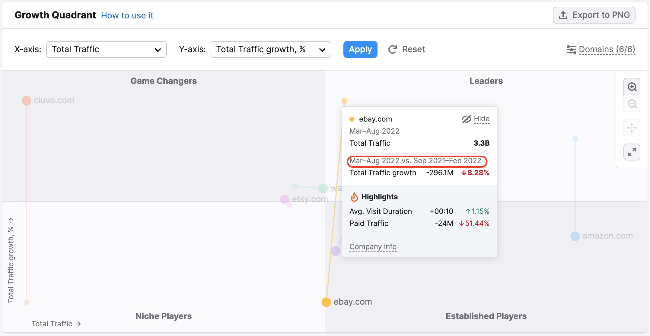
Growth Quadrant
The next section within the Overview Report is the Growth Quadrant. This matrix paints a picture of the overall competitive landscape within your market, showing you where each of the competitors from your market list stand over a given period.
If you are a .Trends user, you have the option to customize your view in a few different ways:
- By changing the time period and location
- By turning “Growth Paths” on to view market players’ growth across the selected period of time
- By setting up axes to analyze competitors from different perspectives
- For example, to analyze traffic quality set axis to Total Traffic and Bounce Rate
- To analyze audience engagement set axis to Total traffic and Avg. Visit Duration
- To analyze the estimated percentage of sessions that ended with a checkout, select Purchase Conversion as part of the axis
- By revealing or hiding certain players on the matrix
- By viewing in full-screen mode or zooming in or out
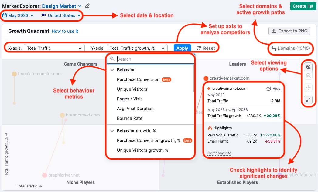
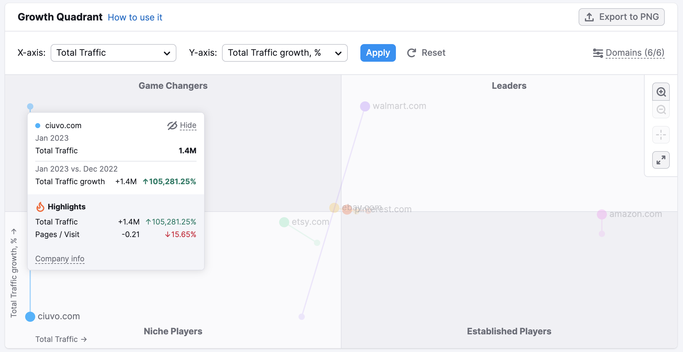
As you can see, the domains are divided into four quadrants:
- Niche Players: Sites with a smaller market share compared to the others and who are growing relatively slowly. These could be new competitors still getting started or domains that have lost some momentum.
- Game Changers: Domains that still have relatively low traffic volume but a sharp growth rate, higher than the average for the market. In other words, these domains are growing quickly, and you might want to keep an eye on them.
- Leaders: Domains that not only have high traffic volume but also continue to grow at a sharp rate compared to the market average.
- Established Players: The inverse of Game Changers, Established Players have high traffic volume but a relatively low growth rate. Generally, these domains would have high name recognition, having been in the industry for a long time.
It’s important to note that each domain is sorted relative to the other domains on the matric. In other words, if you adjust the list of domains or the time period you’re looking at, you might find that the domains are sorted differently.
Domains might also shift over time. For example, if you compare reports from different periods, a Game Changer might grow enough to become a Leader, or might lose momentum and slip back into being a Niche Player. You can get more information on such changes by enabling the Growth Paths view and hovering over both starting and finishing points.
Top Market Keywords
The Top Market Keywords widget lists the top keywords bringing traffic to domains in the analyzed market. It’s displayed in the form of a word cloud, meaning that keywords appear larger if they generate more traffic and search volume. To view specific search volume and traffic metrics for a certain keyword, place your cursor over it, and a window will appear.
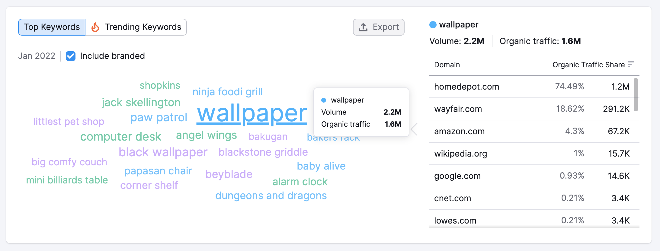
To the right of the Top Market Keywords cloud, you will find a Keyword Traffic chart. This chart displays the share of organic traffic generated by the selected keyword for domains within the analyzed market. Click on any keyword from the Top Market Keywords cloud in order to select it.
Click the “Export” button to download your Top Market Keywords as a PNG or CSV file.
Domain vs Market Dynamics
The Domain vs. Market Dynamics section of the Overview Report analyzes the performance of one domain relative to the market as a whole. The chart will automatically show data on any domain selected in the Share of Visits widget directly to the left of the chart. This chart is useful not just for benchmarking yourself against competitors but also against the trends across the entire market.
Share of Visits
The Share of Visits section tells you what percent of visits across the market belong to each domain during the analyzed period. You can view this in total, or you can narrow the data by choosing Direct, Referral, Organic Search, Paid Search, Organic Social, Paid Social, Email, and Display Ads.
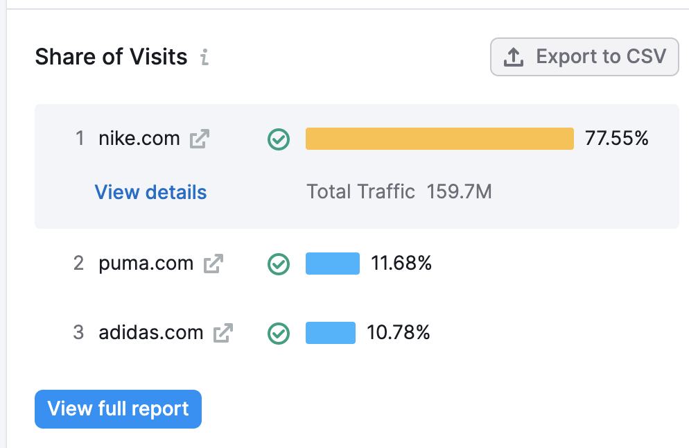
If you’d like to use this data elsewhere, such as in a report or presentation, you can export this data into a CSV file.
Total Traffic Trends
The Total Traffic Trends graph benchmarks your domain’s traffic trends over time against that of the entire market during the same period.
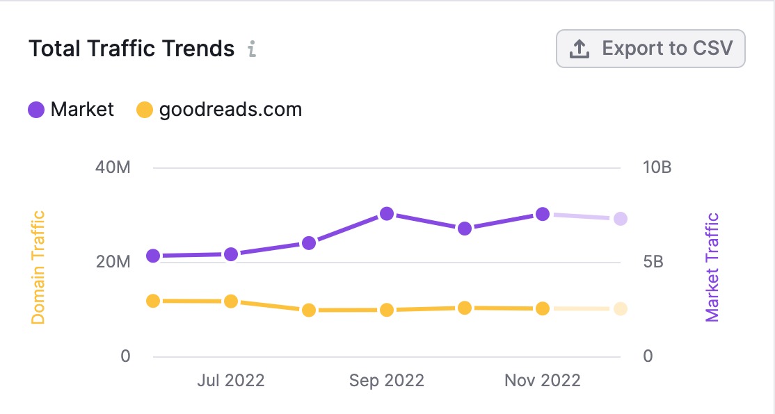
When reading this graph, the domain traffic (indicated in the image above in yellow) is measured according to the left axis. The overall market traffic (in purple) is measured according to the axis on the right. This enables you to more easily compare your domain’s traffic changes over time to the trends of the whole market during that period, despite the differences in volume.
Click “Export to CSV” to download this data and use it elsewhere.
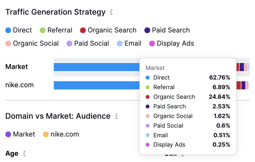
Traffic Generation Strategy
Traffic Generation Strategy is a bar graph that breaks down the percent of the traffic generated by each channel, compared to the total market.
To see a numerical breakdown, all you have to do is hover your cursor over the line you’re interested in, as follows:
Domain vs Market: Audience
Domain vs. Market: Audience breaks down some basic information about the market audience demographics. Here, you can learn the proportion of male-to-female audience members, as well as how many of them fall into each age bracket.
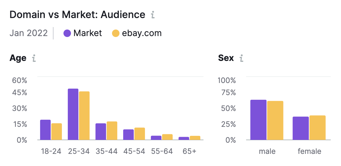
If you are a .Trends user, more detailed information about audience demographics can be found in the Demographics report on the next tab.
Market GEO Distribution
The Market Geo Distribution section shows you the top five countries where your audience is around the world. You can view this data by:
- Top Countries: The countries that account for the most visitors
- Top Changes: The countries with the largest changes in traffic compared to the previous month
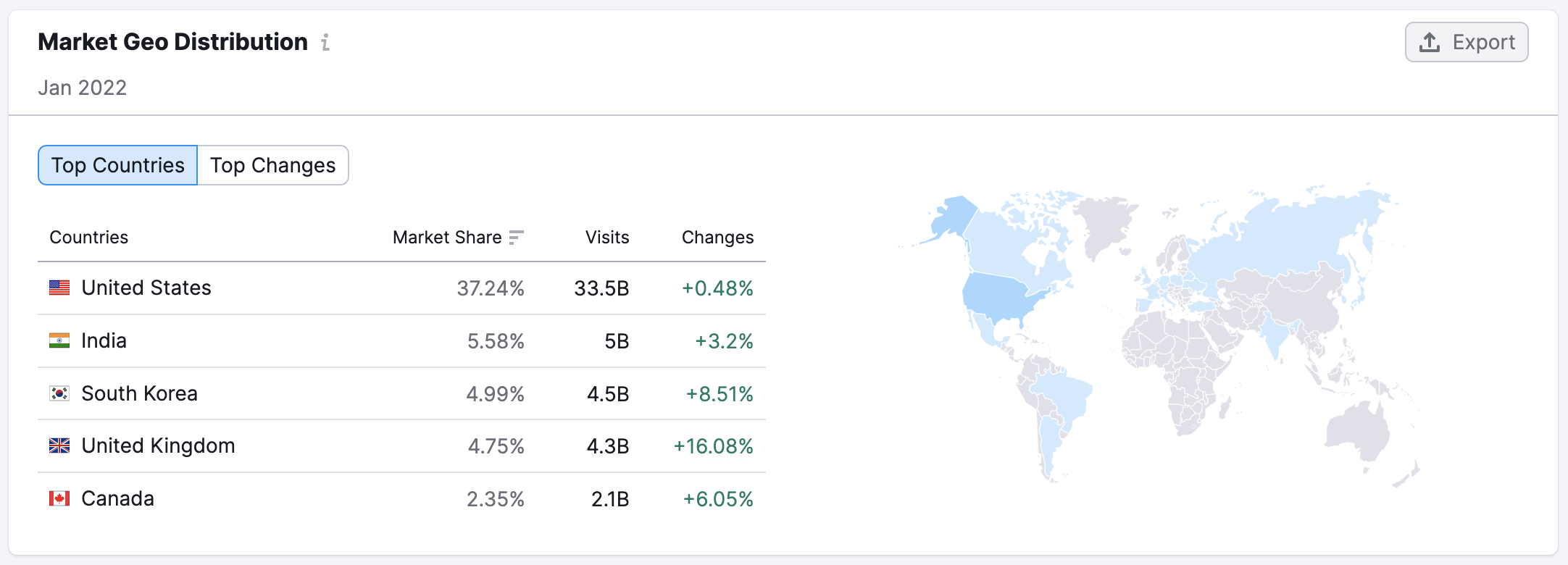
Market Geo Distribution can be downloaded either as a CSV file or a PNG file. Simply click “Export” and choose your preferred file type.
Market Traffic
The final section of the Overview report is Market Traffic. This chart illustrates the total traffic over time across all the analyzed websites in the selected market, broken out by channel. You can also see the traffic forecast that appears as the grayed-out portion of the graph. You can hover over this part of the graph for more details. Traffic forecasts are based on the current month’s metrics so far and are updated once a week. These predictions can help you stay ahead of emerging traffic trends and prepare your strategy before your competitors do.
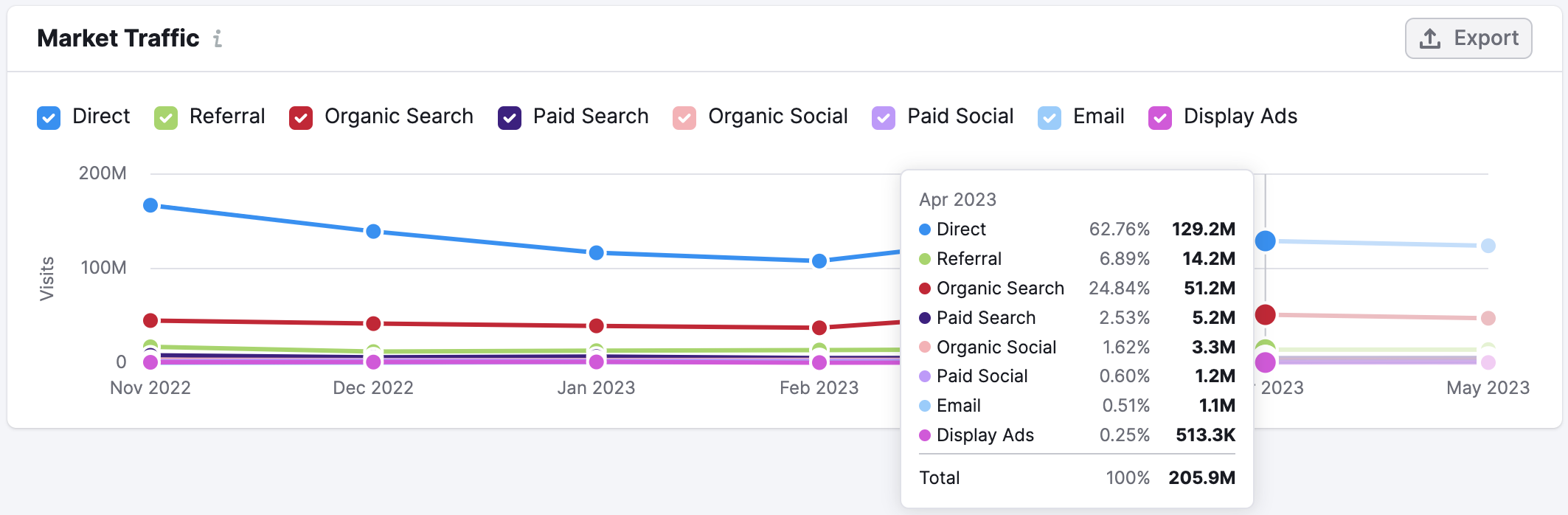
Here, you can estimate their overall market size (based on the amount of traffic generated), see how the market has changed over time, and determine which channels were most effective in driving growth. This can provide important context when analyzing your overall growth and deciding which traffic channels you need to develop. You can also deselect a certain channel if you do not want to view it on the chart.
You can download this chart in PNG or CSV formats. Just click “Export” and select your preferred file type to download.